What skills does an engineer need to be a successful professional?

tapas_das_interview

Last year I took one of the most important decisions in my life, which was to quit my jobs in my home country and move to the United States of America to start a Master of Sciences in Industrial Engineering at University of South Florida, in Tampa, Florida, an educational institution in with the status of “preeminent state research university”.

When I first came to Tampa to get to know the university before starting my studies I had the opportunity to talk to Dr. Tapas Das, Chair of the Department of Industrial and Management Systems Engineering at the University of South Florida. I wanted to know what skills I needed to succeed as an engineer and who better than him to answer these questions.

So I asked him for an interview and he gladly accepted. Here I am telling my experience as an graduate student to understand how what he mentioned in the interview are actually applied in the program I am studying at University of South Florida.

In the next line I will try to summarize some of the aspects that are actually very accurante to what Dr. Tapas Das told me:

  1. Communication is an important skill for engineers (and indeed for every professional): Some of the courses in taking require a lot of presentation skills. I need to be sincere on this. I have been teaching for the last 17 years and this skill is kind of familiar to me, but not every engineering student is able to make a presentation to communicate ideas in a way that they can draw the attention of their audience, use the right amount of content in the presentation with clear objectives within the stipulated timeframe. I have seen this even in experienced professionals both here in the USA and back in Peru. That is why within the data science field I devote most of my time to learn about data visualization and storytelling skills. I think that no matter how good you are in math or statistics as an engineer if you cannot properly communicate your ideas. USF places a lot emphasis in this aspect which translates in homeworks and projects that takes this important aspect into account.
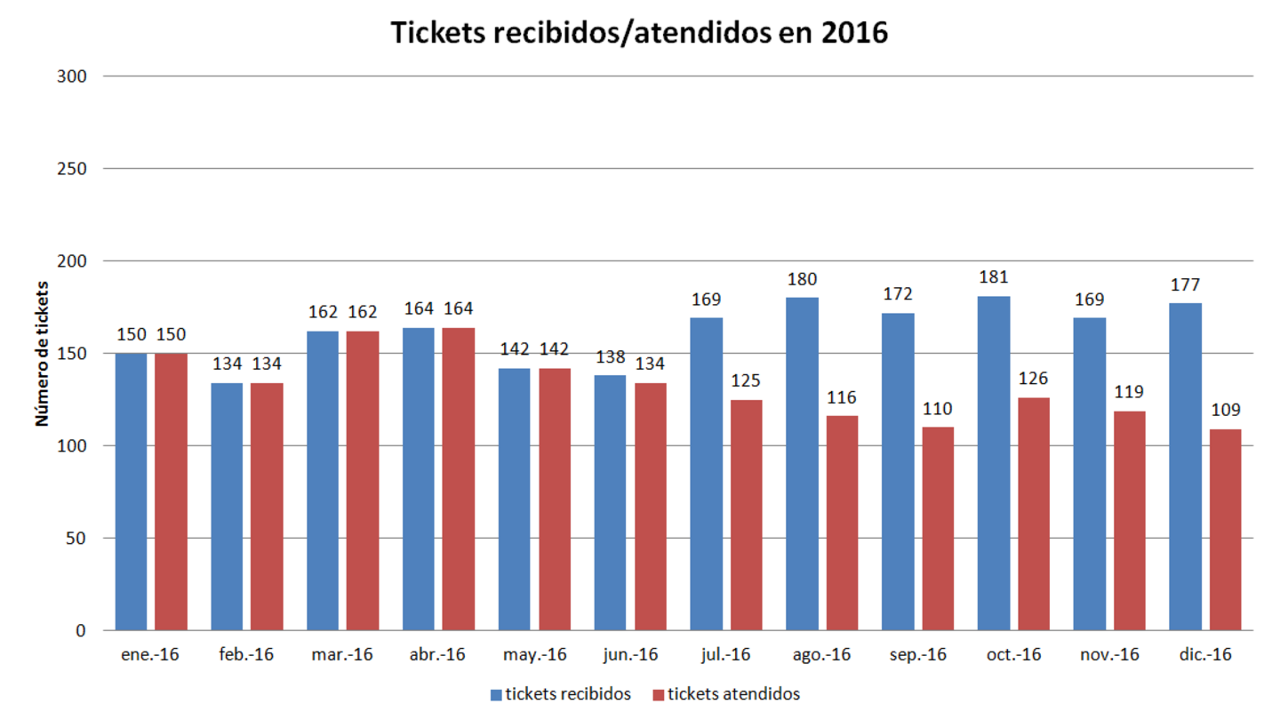
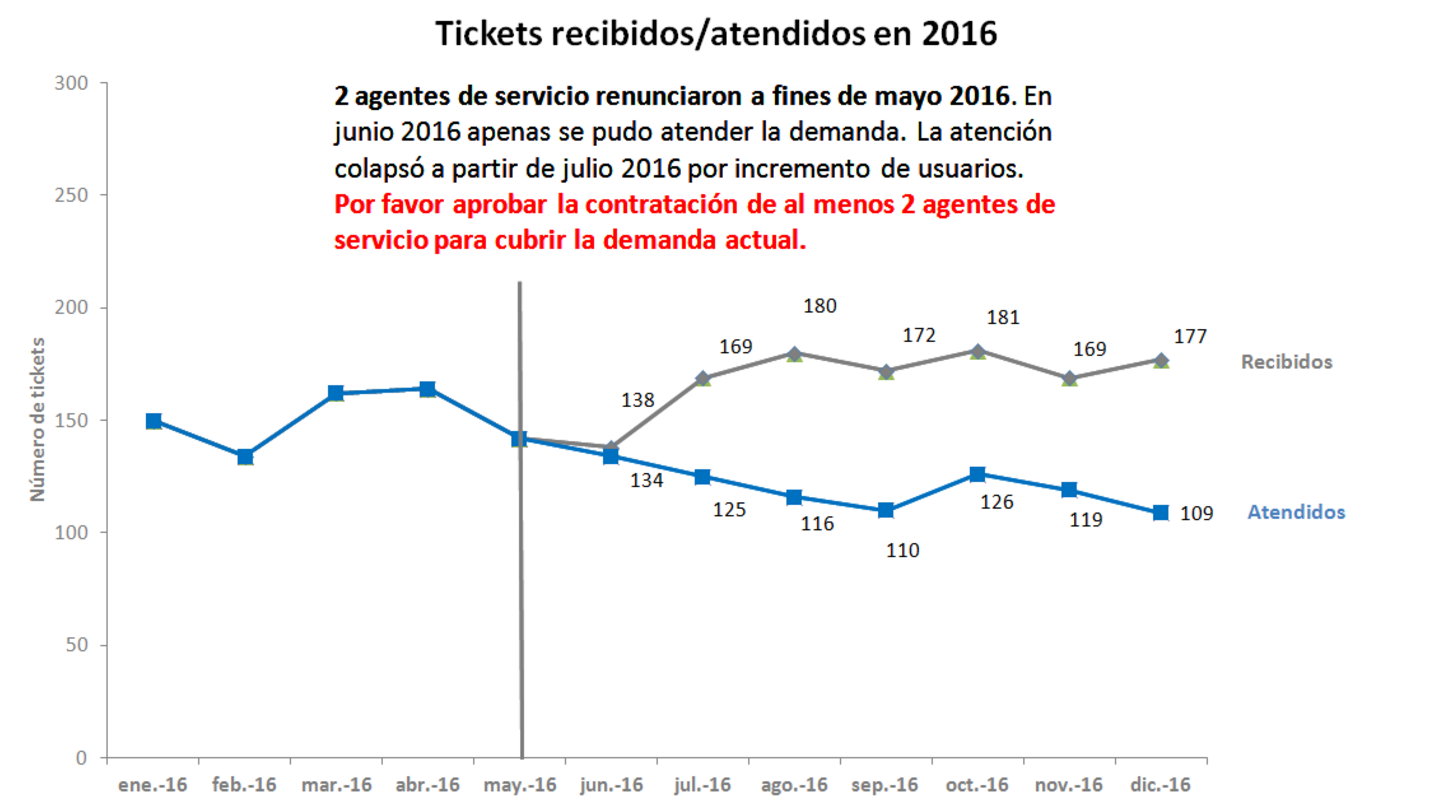
  2. Data driven decision making using data is across the board, everybody is going to benefit from that: the courses I have liked the most in the master program, are related to data. I am taking a course on Statistics this semester as an open student in which I am learning not only how to use a formula to solve an exercise but how we actually apply Statistics in common problems every day, even without knowing we are doing so. Engineering Analytics is a course I liked a lot last semester since we got the opportunity to apply our knowledge in a real data science competition. Being able to apply what you study actually lets you know how good your learning is. That is why I am firm believer in project based learning to solve real problems instead of being just a listener in a class
  3. Team work is important: My experience working in teams has taught me that expecting everyone in a team to contribute equally is not only unrealistic but counterintuitive since not everyone posses the same skills. It is perfectly fine to let somebody contribute more in a part in which one is more skilled and later other members might contribute in other different areas in which they are more skilled. Sometimes people will find hard to understand that approach because in school or even university we were taught or expected to contribute equally but that does not happen in real life. Every individual have different skills and understanding that premise is hard at first, but the best results are obtained that way in my experience. I think that make everyone feel talented in a group despite different contributions made in a project is a challenge but when we succeed, team work succeeds.

In summary, I was quite amazed to learn that nowadays the skills that are most demanded are the ones that build relationships even in classical fields like engineering where math and science skills are imperatively needed. The idea of the lone genius discovering solutions by themselves is long gone by now and data literacy, communication and team work is the new skillset for a successful professional.

Here is the transcript for the short interview to Dr. Tapas K. Das:

AF: In your opinion, what is the profile or skills needed to succeed profesionally as an engineer?

TD: OK, As an engineer, right?. Not only as an industrial engineer, right?.

AF: Right, as an engineer. 

TD: I think that the most important skillset for an engineer is communication. The ability to communicate both in writing and verbally, in both ways, is an important aspect of engineering. Engineers makes decisions and for decision making, they need to be involved in team work and so if they can communicate to the team, they can make good decisions. Of course they need to know the engineering part of it too, but the reason I am putting communication ahead of engineering skills is because we know no matter how much you know you are not going to be able to do well without these skills.

AF: Soft skills?

TD: Actually nowadays people are objecting to call them soft skills, because by saying soft skills it seems like we are taking the value off from those skills, by calling them soft. Those are hard skills too: communicating in both ways, in written and in verbal form, it is not easy.  Leadership, team work, etc. these are all skills that need to be acquired.

AF: Should we called them main skills?

TD: Yes, they are an integral component, these are like a portfolio that an student, an engineer must acquire.

AF: What technologies do you think will have the most impact in our society in the next years?

TD: I do not have a special potion to answer this question but undoubtedly data skills: skills to put data into decision making is going to be an skill that will be above most skillsets in coming years, as clearly as you can see, because in the past people went to dig for gold, now gold is hiding in the data, data is the new oil. Now you can mine in the data to find the value you are looking for.

AF: That skill is for any professional not only engineers, right?

TD: For every professional. Data driven decision making using data is across the board, everybody is going to benefit from that.

AF: What books, fiction of non fiction, would you recommend to read to an engineer?

TD: I am not sure that I have an specific recommendation for a book to read, there are plenty of books in those areas: writing, communication, team work, etc..

AF: Is there any professional field that you would recommend to an engineer to work in?

TD: That is a broad question. I think, fields where data driven intelligence can make more gains. That is what everybody is talking about now. Everybody is talking about artificial intelligence, which is really a fancy nice word, even though is not new, it is been there forever. Artificial intelligence is finally coming to benefit us. Now we have the ability to really benefit from it, because we have the tools to glean the intelligence from data. We have the algorithms, we have the computing power, we have the tools, the sensors that are collecting data. Now it is the time for artificial intelligence. So I think that engineers looking to choose their field, it does not matter whether it is in healthcare, manufacturing, service areas, banking, consulting, etc. everything is data driven. So developing skills to build artificial intelligence or being able to learn what is in the data through those algorithms is going to be the main push. Everybody is looking for engineers who can do that, who can work with A.I.. Artificial intelligence is the key, is the set of the keywords right now.

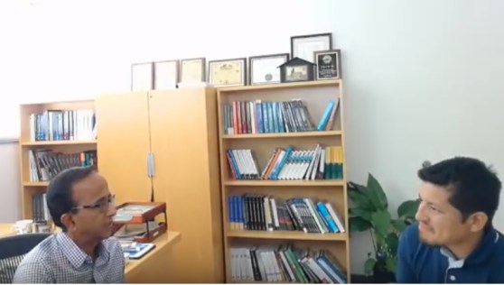
Here is a little fragment of the video of the interview:

Cómo el uso de Analytics está transformando el fútbol y los deportes

liverpool

Es ya sabido que cada vez es mayor el número de empresas u organizaciones que vienen haciendo uso de Analytics en sus estrategias de negocios. Sin embargo, esta tendencia no solamente se ve en los negocios sino también en el ámbito deportivo, pues el uso estratégico de Analytics, desde hace algunos años, ya ha empezado a influir de manera creciente en las tácticas y decisiones de los deportes profesionales, tales como el béisbol y el baloncesto.

Pero si abordamos el ámbito relacionado al fútbol, este nunca ha sido un deporte dependiente, en gran medida, de los análisis para tomar decisiones, tal vez porque tradicionalmente se veía al fútbol como una disciplina deportiva poco adecuada para el enfoque analítico. Para ilustrar esta diferencia con el béisbol, un caso de estudio interesante es el de los Oakland Athletics, un equipo profesional de beisbol de los Estados Unidos, que, a inicios de la década del 2000, comenzó a utilizar un enfoque analítico en sus decisiones, al tomar como base los principios de una disciplina llamada Sabermetrics, la cual hace uso de técnicas estadísticas para analizar los registros del béisbol y hacer determinaciones sobre el rendimiento de cada jugador, así como también de la actividad en el juego, mediante la recopilación y el resumen de los datos relevantes para responder preguntas específicas, por lo cual alguna vez se acuñó a esta disciplina como “la búsqueda de conocimiento objetivo sobre béisbol”. El término se deriva del acrónimo SABR, que significa Society for American Baseball Research, fundada en 1971.

Esta tendencia comenzó cuando Billy Beane, un exjugador de beisbol convertido en ejecutivo, asumió el cargo de gerente general del equipo de los Oakland Athletics en 1997 y luego contrató a Paul DePodesta, un joven estadístico egresado de Harvard, como su asistente. A través del análisis estadístico realizado por Beane y DePodesta en la temporada del año 2002, los Oakland Athletics ganaron 20 juegos seguidos y llegaron a los playoffs de esa temporada. El éxito de los Oakland Athletics alentó a muchos equipos de beisbol, y de otras disciplinas deportivas en todo el mundo, a replicar el modelo promovido por Billy Beane.

Sus enfoques sobre el béisbol pronto obtuvieron reconocimiento mundial cuando Michael Lewis publicó “Moneyball: el arte de ganar un juego injusto” en el año 2003, libro donde detallaba el exitoso uso de esta disciplina llamada Sabermetrics, por parte Beane y DePodesta, y cómo el equipo de béisbol de los Oakland Athletics logró conseguir una ventaja competitiva frente el resto de equipos al evaluar a los jugadores usando un criterio diferente, pues tradicionalmente estos jugadores eran reclutados por aspectos visibles como velocidad, aspecto físico o popularidad, cuando las métricas usadas por los Oaklands Athletics se centraban en conseguir victorias, para lo cual debían conseguir carreras y evitar que su oponente complete carreras. Posteriormente, y debido al éxito de la publicación del libro de Lewis, en el año 2011, se estrenó una película basada en este libro, también llamada “Moneyball”, protagonizada por Brad Pitt y Jonah Hill, la cual se convirtió en un éxito mundial de taquilla e hizo incluso más conocidas las estrategias utilizadas por los Oaklands Atheltics.

De manera específica, las estrategias de Beane y DePodesta se centraron en dos métricas poco relevantes en el mundo del beisbol hasta ese momento: porcentaje en base (OBP, por sus siglas en inglés) o porcentaje de veces que un jugador llega a una base en su turno y porcentaje de slugging (SLG, por sus siglas en inglés) o cuán lejos, en cuanto a cantidad de bases, llega un jugador en su turno. Todo esto fue considerado en un modelo estadístico que determinó que, para tener una gran probabilidad de llegar a los playoffs, debían ganar 95 juegos, con una diferencia positiva de 135 carreras en total durante toda la temporada.

A diferencia del béisbol, siguiendo la sabiduría convencional, el fútbol parecía, aparentemente, imposible de cuantificar, pues gran parte del juego implica mover la pelota de un jugador a otro mientras se espera la oportunidad de crear una situación para anotar. Pero esto se demostró que estaba equivocado cuando Ian Graham, un PhD en Física de la Universidad de Cambridge y Director de Investigación del Liverpool F.C, creó desde cero su propia base de datos para seguir el progreso de más de 100,000 jugadores en todo el mundo, y, de esa manera, poder recomendar cuál de estos jugadores debería adquirir el Liverpool F.C., equipo para el cual todavía trabaja en la actualidad, y, posteriormente, cómo estos nuevos jugadores deberían ser parte de la estrategia del club. Graham realiza este análisis al introducir datos detallados sobre los juegos en sus modelos de decisión y, al contrario de lo que cabría esperar, no mira los juegos de fútbol para crear estos modelos, porque cree que esto contribuye a crear un sesgo negativo para tomar las decisiones adecuadas.

Los resultados de los últimos años del Liverpool F.C. son la evidencia tangible de que las estrategias estaban funcionando, ya que fueron tanto subcampeones (2017-18) como campeones (2018-19) en las últimas dos temporadas de la UEFA Champions League y, sean cuales sean sus resultados futuros, los resultados sobresalientes del Liverpool F.C. ya han comenzado a generar cambios en las formas tradicionales de tomar decisiones en este deporte, no solo en Inglaterra sino más allá. Como resultado, más equipos de fútbol contemplan contratar especialistas en Analytics, sin importar mucho si poseen experiencia en fútbol, para intentar replicar este éxito único.

Adicionalmente, un dato interesante que vale la pena notar es que fue el mismo Ian Graham quien recomendó al Liverpool F.C. adquirir al futbolista egipcio Mohamed Salah en el año 2017, quien en ese momento jugaba en Italia. Ese año, Liverpool F.C. pagó a la A.S. Roma, un club de fútbol italiano, alrededor de USD 40 millones por Salah. Los datos de Graham mostraron que Salah sería un buen partido para el jugador brasileño Roberto Firmino, otro de los delanteros del Liverpool F.C., cuyas estadísticas mostraban que generaba más goles esperados de sus pases que casi cualquier otro jugador en su posición, y, finalmente, esa predicción resultó ser cierta: durante la siguiente temporada 2017-18, Salah convirtió esos goles esperados en reales y al mismo tiempo rompió el récord de la Premier League al anotar 32 veces en una temporada.

Los especialistas en Analytics ahora están registrando datos de miles de acciones durante los juegos y las sesiones de entrenamiento. Pero no se trata tanto de recolectar datos únicamente sino más bien de dar sentido a estos datos. Los clubes de fútbol en la última década han tenido que lidiar con una revolución tecnológica y lo que eso significa es que han comenzado a recopilar muchos datos como base de su estrategia. Los datos deportivos son básicamente una reconstrucción del partido, pero ¿por qué es útil recopilar todos estos datos? La razón principal es tener una manera de contar una historia detallada de cómo se jugó un partido específico y la posibilidad de verlo a través de diferentes lentes, por ejemplo, cuántos pases y disparos se hicieron, también denominados datos de eventos, y, de la misma manera, desde hace poco se ha empezado a recolectar los datos de seguimiento usando chalecos de rastreo GPS portátiles, y que nos permiten ver la actividad detallada de cada jugador a través de puntos que se desplazan por el campo o visualizaciones de mapas de calor, para que sea posible contar la historia detallada de un partido de una mejor manera, ya que todo lo que hace un jugador queda registrado.

El uso de Analytics está impulsando las estrategias de las principales empresas y organizaciones de todo el mundo y, ahora, estos métodos se están aplicando al fútbol y, en general, a muchas otras disciplinas deportivas, ​​desde la sala de juntas hasta la sala de entrenamiento.

Las microbrands y los nuevos modelos de negocio

En la edición del 10 de noviembre de The Economist, leí un artículo interesante acerca de las microbrands, es decir marcas que venden uno o pocos productos o servicios para unos pocos individuos, es decir el más puro ejemplo de segmentación y personalización. Ejemplos de estas microbrands son Casper, un e-commerce de colchones, Warby Parker, un e-commerce de lentes y Dollar Shave Club, un e-commerce de venta de cuchillas de afeitar y artículos de cuidado personal.

A diferencia del pasado donde las grandes empresas fabricaban muchos productos o servicios que iban dirigidos a segmentos muy grandes de mercado y el éxito del negocois estaba determinado por la producción de grandes volúmenes en economías de escala, ahora la diferenciación basada en hábitos y gustos, posible gracias a la analítica de los datos que se generan cuando los usuarios interactúan con la marca a través ya sea del mismo producto o servicio o de los diferentes canales, marca el éxito de los nuevos modelos de negocio que están haciendo temblar a las grandes empresas, a las cuales les queda finalmente transformarse o comprar esas microbrands.

Estas nuevas empresas, que nacen en la forma de startups, tienen características en común: nacen digitales, por lo que es común que su agilidad para cambiar su propuesta de valor o incluso de modelo de negocio, es mucho mayor en comparación a las empresas tradicionales. Además, usan plataformas digitales tanto para brindar directamente su producto o servicio -direct-to-consumer (DTC)- al segmento cuyas necesidades atienden como para recolectar todos los datos posibles sobre las preferencias y experiencias de sus clientes. Finalmente, son parte de la llamada cola larga (long tail) es decir del grupo de pequeñas empresas que son dueñas de segmentos pequeños de fieles clientes, que ven en estas empresas una solución a sus necesidades más específicas.

Por otro lado, imaginemos que hace un par de decadas a alguien se le haya ocurrido fabricar un producto en pequeñas cantidades para una nueva empresa que apunta a un segmento específico de clientes, lo más probable es que no hubiese conseguido a un proveedor que acceda a fabricar pequeñas cantidades de un producto por no ser rentable. Hoy, gracias a los cambios en la manufactura y en el conocimiento que nos brindan los datos, es posible fabricar lo que su segmento de clientes requiere, en pequeñas cantidades, haciendo posible fallar probar rapidamente si algo funciona o no y ya no abarrotarse de inventario, lo cual incrementa el riesgo financiero de una empresa.

Y en el caso de plataformas digitales, Shopify, por ejemplo, brinda una completa solución de e-commerce basada en la nube, es decir sin la complejidad de adquirir y configurar un hosting, por menos de USD 30 al mes. Y en cuanto a publicidad, es posible segmentar por muy pocos dólares y de manera muy específica los avisos, ya sea con Facebook Ads, para perfiles de usuario en esta red social, o con Google Ads, para las palabras claves usadas en las búsquedas.

Actualmente, las grandes marcas tradicionales deben tomar decisiones con respecto a este nuevo tipo de competencia, ya sea adquirir estas microbrands o crear sus propias startups, que compitan con ellas, a través de intraemprendimientos, sin embargo lo que todas deberán hacer es, definitivamente, aprender de ellas.

20181110_WBP501

Conceptos básicos de Lean Analytics

El libro Lean Analytics Book indica cómo se debe de medir un negocio basado en los siguientes arquetipos:

  1. Ecommerce
  2. Marketplace
  3. Software As a Service
  4. Mobile App
  5. User Generated content
  6. Media

Principales métricas para saber si un producto tiene atracción

1. Adquisición del Cliente

  • CPC (Cost Per Click)
  • CTR (Click-Through Rate)
  • CAC (Customer Acquisition Cost)

2. Productos Digitales

  • Número de descargas
  • Usuarios activos diariamente
  • Promedio de ingresos por usuario

3. Fidelización

  • Tasa de referencia
  • Coeficiente viral
  • Tasa de recompra

4. Valor del Cliente

  • LTV (Lifetime Value)

5. E-Commerce

  • Promedio de compras en la web
  • Tasa de abandono

6. Email Marketing

  • Tasa de apertura del mail
  • Costo por suscriptor
  • Tasa de crecimiento de suscriptores.

Storytelling con datos: no solo muestres tus datos, cuenta una historia. Parte I: contexto y visualización.

En la escuela aprendemos bastante acerca de lenguaje y matemática: en lenguaje, aprendemos cómo poner palabras en oraciones e historias, y en matemática, aprendemos a encontrarle el sentido a los números, sin embargo es bastante raro que estos dos campos se combinen: nadie nos enseña a contar historias con números. Actualmente, la tecnología nos brinda cada vez más grandes cantidades de datos y, junto con esto, nos plantea la exigencia de comunicar los descubrimientos que realizamos en estos datos para poder entenderlos, por ello, la capacidad de encontrar la más adecuada visualización para estos datos es vital para convertirlos en información y usarlos para tomar decisiones.

Muchas veces, los profesionales mencionan en su hoja de vida, su proficiencia en herramientas de ofimática, sin embargo, esto es lo mínimo deseable para cualquier empleador y ya no es diferencial para competir. De la misma manera, poner unos cuantos -o muchos- datos en una hoja de cálculo o en una presentación, implica para algunos que la visualización termina allí, cuando lo que muchas veces ocasiona es que la historia detrás de los datos sea difícil o imposible de entender. Y sí, efectivamente, hay una historia detrás de los datos pero las herramientas no la conocen, pues aquí es donde se distingue la capacidad de un profesional de traer la historia a contexto con la visualización adecuada. Esta, es la capacidad de contar historias con datos, o storytelling con datos.

La importancia del contexto:

Para empezar a entender la importancia del contexto, es necesario diferenciar entre el análisis exploratorio de los datos y el análisis explicativo de los datos. El análisis exploratorio es lo que hacemos para familiarizarnos con los datos, para esto podemos empezar con una pregunta o hipótesis para lograr entender qué puede ser interesante acerca de estos. En resumen, es la capacidad de convertir una gran cantidad de datos en uno o unos cuantos descubrimientos. Por otro lado, el análisis explicativo es lo que hacemos cuando ya hemos decidido qué descubrimientos vamos mostrar a nuestra audiencia, es decir centrarnos en el qué datos vamos a mostrar, a quién se los vamos a mostrar y cómo los vamos a mostrar. Esta parte es donde específicamente se centra la capacidad de contar historias con datos.

Para esto, empezaremos con un ejemplo: el jefe de un área de mesa de ayuda, ha tenido muchos problemas durante toda la mitad del año 2016, debido a que en el mes de mayo de 2016, dos miembros de su equipo renunciaron y desde ese momento su área no ha podido satisfacer la demanda de atención y, por ende, su calidad de servicio ha disminuido de manera crítica. Este jefe tiene los datos de atención de todo el año y va a mostrarlo al comité de productividad de su empresa, que son los encargados de aprobar las contrataciones de personal necesarias para cada departamento, pues necesita que el comité apruebe la contratación de dos nuevos miembros para su equipo. Finalmente, los datos a disposición son muchos pero únicamente necesita mostrar aquellos que ilustran la diferencia entre la demanda de atención y la poca capacidad de satisfacer dicha demanda partir de mayo de 2016. En este punto es importante recalcar un error muy común: decidir qué datos mostrar y, más aún, qué enfatizar.

Así como un museo es valioso no por las obras que muestra sino por las obras que no muestra -de lo contrario sería un almacén y no un museo-, una presentación debe ser valiosa por la selección de datos que incluye y, sobre todo, por lo tuvo que dejar de lado para armar dicha selección. En resumen, el contexto de este caso sería el siguiente:

  • ¿QUIÉN?:
    El comité de productividad de la empresa encargado de aprobar las contrataciones de personal para cada departamento.
  • ¿QUÉ?:
    Enfatizar la necesidad de aprobación por parte del comité para la contratación de dos nuevos integrantes para su equipo.
  • ¿CÓMO?:
    Mostrando los datos que ilustran la diferencia desde mayo de 2016 entre los tickets presentados y los tickets atendidos debido a la renuncia de dos integrantes de su equipo, poniendo énfasis tanto en el punto de quiebre en la diferencia desde dicha fecha.

Escoger una visualización adecuada:

Otro de los mayores errores que los profesionales cometen, es la mala elección de la visualización de datos. En la siguiente imagen, si pidiera buscar la cantidad de veces que aparece el número 3, probablemente me tardaría 15 a 20 segundos explorando la imagen.


Captura de pantalla 2017-09-13 a la(s) 18.28.13

Sin embargo, en la siguiente imagen, la misma búsqueda puede tomar 3 segundos como máximo y, probablemente, la mitad de esfuerzo. La razón es simple: hemos enfatizado la parte a la que quiero que mi audiencia preste mi atención, mediante el uso de negritas. De la misma manera, también hubiera sido válido el uso de color y elementos visuales adicionales.

Captura de pantalla 2017-09-13 a la(s) 18.28.33

En la siguiente imagen, podemos ver un típico gráfico de barras, donde se muestra la información descrita en el caso anterior que presenta los tickets recibidos y los tickets atendidos cada mes por el departamento de mesa de ayuda durante el año 2016. A primera vista, no es fácil reconocer el objetivo del gráfico, aunque después de unos segundos, es posible ver que la diferencia entre los tickets atendidos y los tickets recibidos se incrementa a partir de la mitad del año. Si bien se requiere observar bien el gráfico para descubrir esto, la razón de esta diferencia se desconoce por completo.

Captura de pantalla 2017-09-13 a la(s) 18.21.38

En esta imagen, usando los mismos datos pero con una visualización distinta, se muestra en un gráfico de líneas, la diferencia entre los tickets de atención recibidos y los tickets atendidos durante todo el año 2016, con una ayuda visual –barra vertical– que enfatiza la diferencia desde mayo de 2016 y añade una pequeña leyenda para indicar que dicha diferencia se debe a la renuncia de dos integrantes y, adicionalmente con mayor énfasis, una llamada a la acción; la necesidad de contratar a dos nuevos miembros para el departamento de mesa de ayuda.

Captura de pantalla 2017-09-13 a la(s) 18.24.53.png


Como conclusión, los dos puntos iniciales a tener en cuenta para empezar a contar una historia es empezar definiendo el contexto: tanto con el análisis exploratorio –qué quiero encontrar– como con el análisis explicativo –contar la historia–, que, a su vez, requiere definir tres aspectos importantes: quién es mi audiencia, qué les quiero decir y cómo lo voy a hacer. Posteriormente, es necesario elegir la correcta visualización para los datos así como enfatizar las partes del mensaje que deseo comunicar a mi audiencia. En siguientes artículos abordaré los factores adicionales que también son importantes para contar historias con datos. Asimismo, no puedo dejar de recomendar el excelente libro ¨Storytelling with Data¨ de Cole Nussbaumer, del cual aprendí y obtuve las imágenes para elaborar el tema sobre el cual trata este artículo.


What unlearning really is

To understand what unlearning is, first we need to explore the definition of learning:

  • The act or experience of one that learns.
  • Knowledge or skill acquired by instruction or study.
  • Modification of a behavioral tendency by experience (such as exposure to conditioning)

From the very definition, the act of learning requires not only obtaining new knowledge, either by studying or by experiencing, but also modifying our future behaviour according to the belief that an specific set of actions will allow us to solve an specific problem or successfully deal with a situation. 

We, humans, do not really learn, instead what we do is to look for a pattern, through trial and error, that can be deemed a good enough solution for a given scenario under our appreciation, which is also called experience. Then, in subsequent situations, we just basically apply the same pattern over and over until we stumble upon a, slightly or completely, different scenario that force us to start looking again for a new pattern to deal with this situation. Here is where the problem comes with what we have previously learned: the approach we take is commonly making the most of our own experience dealing with similar problems we solved in the past. From that knowledge on is where we start looking for a solution, since it would be less efficient to start over from a completely fresh and new approach to a problem that might be solved with a little tweak to our previous experience, because come on, we need optimal times and results, and doing it all over again is not a realistic possibility.

For example, if we are given a challenge to come up with a solution to find a cure to a disease, we might start considering several distinct components for an existing drug or maybe a completely new drug, but maybe the correct approach is not a drug to fight the disease but in preventing that an specific gene in humans reacts to a certain body condition which really causes the disease is manifested. That would represent a totally different schema for fighting diseases that would require to focus not in looking for a cure but rather in data to predict a possible scenario and, consequently, not using physicians to cure diseases but data scientists to predict possible situations and probabilities where the disease is manifested.  

If the example sounds totally out of logic is because our prior learning (physician cure existing disease in human using drug) prevent us from adopting a new frame of mind (data scientist find pattern in data to prevent future disease in human) to deal with a known situation. Today, usage of human data to find patterns to alert us of possible future diseases is more common everyday but without a mindset to leave behind the old -even the current and working- and to make way for the new then there is no possibility yo unlearn.

Unlearning is not about forgetting what we know -because sooner or later we unconsciuosly go back to our old ways- but having the capacity to freely choose a totally different mental model to replace our current one, is being able to look at the things we have known all our life from a totally different perspective to find them different or less logical purposes or reasons, that might even surprise us later.

Finally, both individuals and organizations need to be learning entities but innovation demand unlearning first so that -as stated previously- we can make way for the new.

How does Netflix know what movies I like?

What does Statistics have to do with Netflix knowing what movies you will like? A lot. Specifically with something called correlation. In Statistics, correlation allows us to measure the degree in which two different phenomena are related to one another. It is certainly possible to find correlations everywhere, for example:

  • Temperatures in the summer and sales of ice cream.
  • Completed years of education, the higher your potential to earn.

When one of them goes up, so does the other one. These types of relationships, for example the one of the temperature and ice cream sales, can be represented by a graphic called scatter plot, like the one below:

But then, how does Netflix know me so well to know what movies I will like?  The answers is that it does not know you but it can predict what you will like through the usage of complex statistics using the data of the films you have liked in the past based on how you —and other customers— have rated them.

Netflix estimates that 75% of user activity is driven by automated recommendations that the service provides to its users. Back in 2006, Netflix launched a contest called Netflix Prize in which any person was invited to came up with a new algorithm that improved the existing Netflix recommendation system by at least 10 percent (that is 10 percent more accurate in predicting how a customer would rate a film after watching it). The individual or team that accomplished this feat would obtain one million dollars.

Using what they called “training data” —more than 100 million ratings given to 18,000 films by 480,000 Netflix customers— thousands of teams from 180 countries developed improvements to the existing algorithm to accurately predict the actual rating these customer will give to a selected group of films. After three years of perfecting the algorithm and thousands of attempts by the participants, Netflix declared a winner: a team of seven people conformed by statisticians and computer scientists from several countries.

What this algorithm does is an automated version of what we have been doing for several years to pick a movie to watch: find somebody with a taste in movies that matches yours and ask for a personalized recommendation, knowing that if that person’s likes and dislikes closely approach yours then that person’s choice will be similar to yours. In Statistics this is called correlation.

We can say that two specific variables are positively correlated if a change in one is directly associated to a change in the other one, always in the same direction, this could be the case for the relationship between height and weight. This is because people who is taller generally weigh more (on average); and people who is shorter tend to weigh less (also, on average).

The reason why I emphasize that these associations are not exact but average is because not every observation fits exactly an specific pattern. In some cases, short people weigh more —much more— than tall people,  and in other cases, people who don’t exercise at all are slender than people who frequently exercise. 

One interesting characteristic about correlation as a statistical tool is that it is perfectly possible to express an association among two specific variables in a simple but very descriptive statistic called the correlation coefficient, which features two interesting points to notice. Firstly, that coefficient is just a simple number whose range goes from –1 to 1. When a correlation coefficient is 1, also known as perfect correlation, it implies that an alteration in one of the variables is directly linked to an equivalent change in the other variable in the same direction, and when the correlation coefficient is –1, also known as perfect negative correlation, it implies that an alteration in one of the variables is directly linked to an equivalent change in the other variable, but this time, in the opposite direction. When the correlation coefficient gets closer to either 1 or –1, then it is said that the correlation is stronger. Plus, when the correlation coefficient is 0 or close to 0, then it is said that there is no correlation between the two variables, to make this point clear, we can use the example of the —ridiculous and non existent— correlation between the number of shoes a person owns and the weight of that person. Secondly, when the correlation coefficient is expressed no units are involved, no matter what the nature of and how different each of the variables is, such is the case of the correlation between a variable expressed in units (number of shoes) and a variable expressed in kilograms (weight of a person).

Finally, the most important feat that, in Statistics, a correlation coefficient allows us to do is to simplify what could be very complex relationships among tons of pieces of data —which would require several different charts and tables to express— using an extremely simple descriptive statistic, the same one that Netflix uses to give us an extremely accurate recommendation of the next movie we will watch.